- Knowledge Base and Manual
- MP-Web
- Graphical Tab
-
Installation
-
Integration
-
MP-Desktop
-
MP-Web
- Introduction
- Access
- Side Bar Navigation
- Dashboard
- Favourites
- Datasets
- Summary Tab
- Tables Tab
- Export Tab
- Graphical Tab
- Report Tab
- Mapping Tab
- Manual Data Entry
- Calendar Tab
- Action Plans
- Custom Forms
- Contacts and Alerts
- Compliance
- Task Scheduler
- Monitoring Scheduler
- Calculator
- Data Entry
- Email Importer
- Object Management
- Obligations
- Policies
- Administration
- Administration - Manage Users
- Administration - Datasets
- Administration - Internationalisation
- Administration - Email Importer
- Administration - Monitoring
- Administration - Advanced
- Culture
-
MP-Field
-
Release Notes
-
Reporting
-
Configuration
-
Trial and Demo
-
Monitoring Types
MP-Web Output - Line Graphs Options
MP-Web Graphing additional options
Summarisation
Data can be summarised, which is useful when viewing high-volume data. Select the option to summarise line data, then choose the summary option relevant to your data frequency. Then click Draw Graph. The data can be added to your dashboard in this mode and will be saved with this summarisation.
Split By
Typically each series will be defined by the graphing options in the earlier steps, such as by Sample Point or by Variable. There can be scenarios where the data needs to be split by Data Source or Sample Type. The example below is using the Split By Data Source to create two series one for each of the two Data Sources included in this particular Data Set.

Then an example which is split by Sample Type representing Depths. This could equally be used to compare replicate samples defined by Sample Type.

Axis range
The Y-Axis can be modified to suit. Click on the edit (pencil icon) to open the Axis options window. You can then set a min and max to override the default. This setting is saved and will apply as an override if the plot is added to a Dashboard.
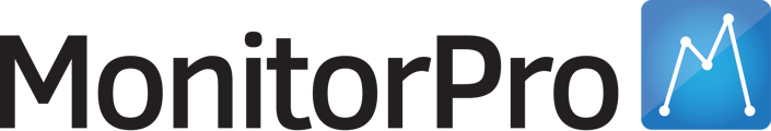
Date Slider
A date slider can be toggled on and off. This is useful for larger datasets so you can restrict down the date range for better analysis of the data. To toggle the slider on and off select the double-ended arrow icon from the menu.
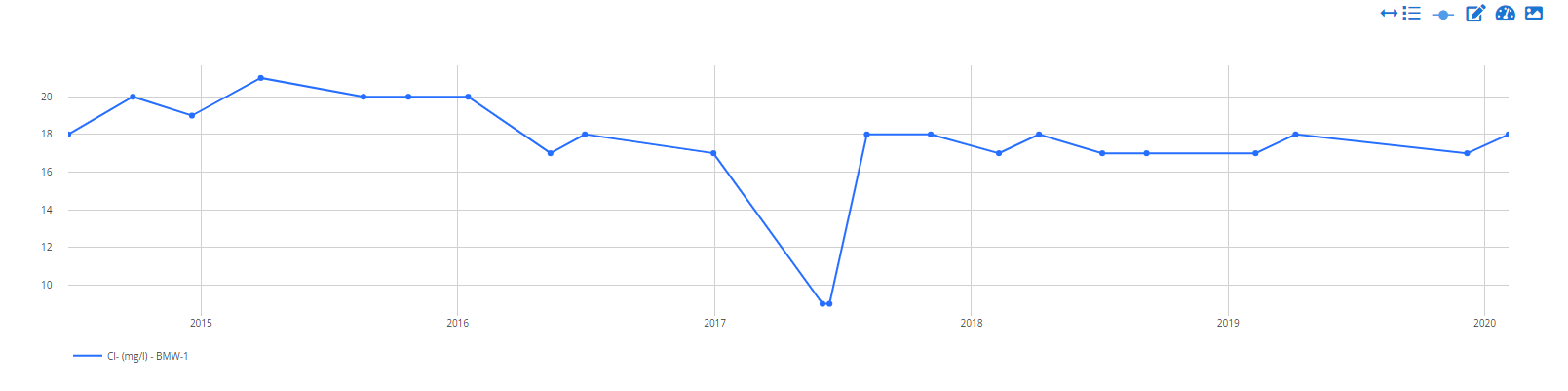
Data Points
Data points can be added to a line chart to see where there are actual data points. Click on the dot icon to toggle these on and off.
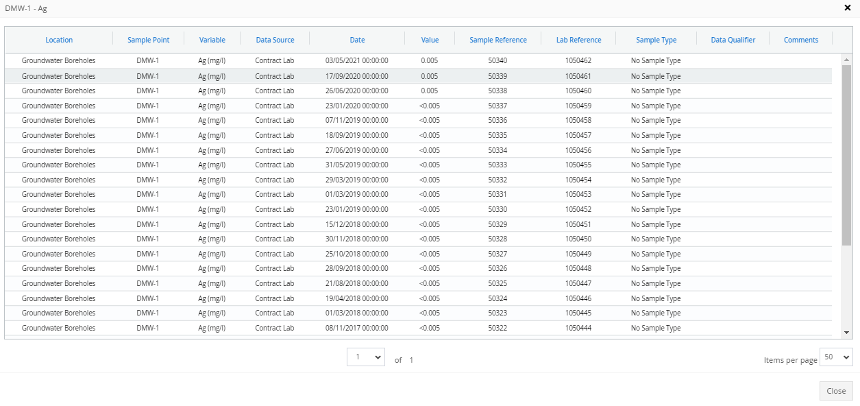
Drill Down
Users can drill down into the data of a particular plot to check values or any outliers.