- Knowledge Base and Manual
- MP-Web
- Graphical Tab
-
Installation
-
Integration
-
MP-Desktop
-
MP-Web
- Introduction
- Access
- Side Bar Navigation
- Dashboard
- Favourites
- Datasets
- Summary Tab
- Tables Tab
- Export Tab
- Graphical Tab
- Report Tab
- Mapping Tab
- Manual Data Entry
- Calendar Tab
- Action Plans
- Custom Forms
- Contacts and Alerts
- Compliance
- Task Scheduler
- Monitoring Scheduler
- Calculator
- Data Entry
- Email Importer
- Object Management
- Obligations
- Policies
- Administration
- Administration - Manage Users
- Administration - Datasets
- Administration - Internationalisation
- Administration - Email Importer
- Administration - Monitoring
- Administration - Advanced
- Culture
-
MP-Field
-
Release Notes
-
Reporting
-
Configuration
-
Trial and Demo
-
Monitoring Types
MP-Web Output - Stacked Bar Charts
How to make Stacked Bar Charts
Introduction
Bar Charts can be made to present data in several ways. Both of these pages describe more of the details around creating these.
Stacked Charts
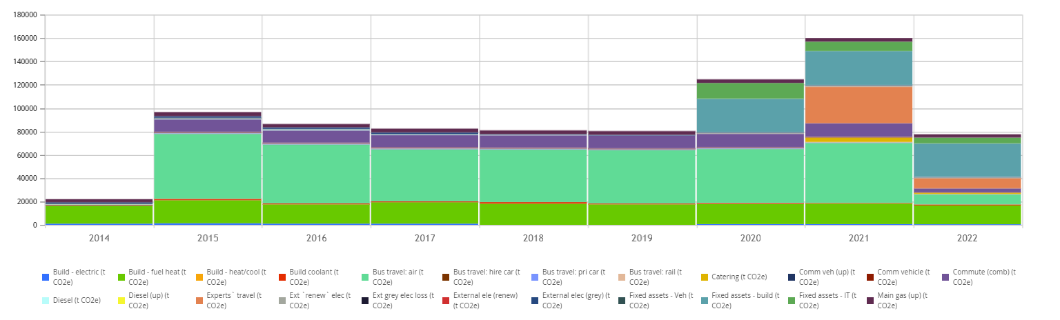
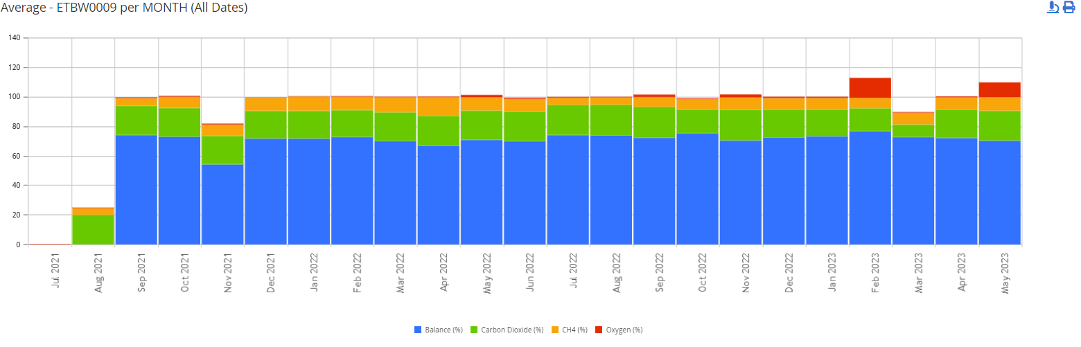
In both options users can stack the data to further improve the display. This example is a Time Series Bar Chart with several Variables stacked to give the total emissions for the year.
Time Series
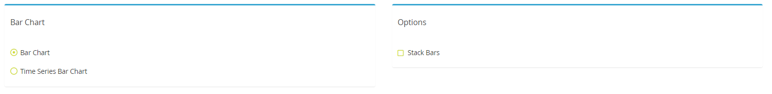
First, choose the type you want, then tick the Stack Bars option.
Choose the Data Series you want to plot (in this example Variables), then choose the bin range for the Time Series.

There will be an option to only include one Sample Point. Then select the Variables to be included within the stack.
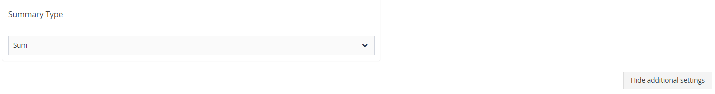
There is an option to show the additional settings. Here the Summary Type can be changed to suit the data in question (it will default to average). This can be important depending on the frequency of the underlying data and what the user is trying to represent. In this example, a Sum of the underlying data for the year represents the annual total.
An example where the summary is monthly
Once happy click on the Draw Graph. If the output is not as desired, but the required amendments to the configuration, then click on the Draw Graph again.
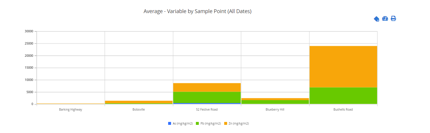
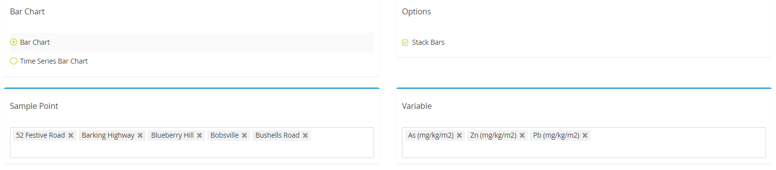
Bar Chart
Select the Bar Chart option and tick the Stacked Bars. Next, choose the Sample Points and Variables to be included. There is an option to multi-select both.
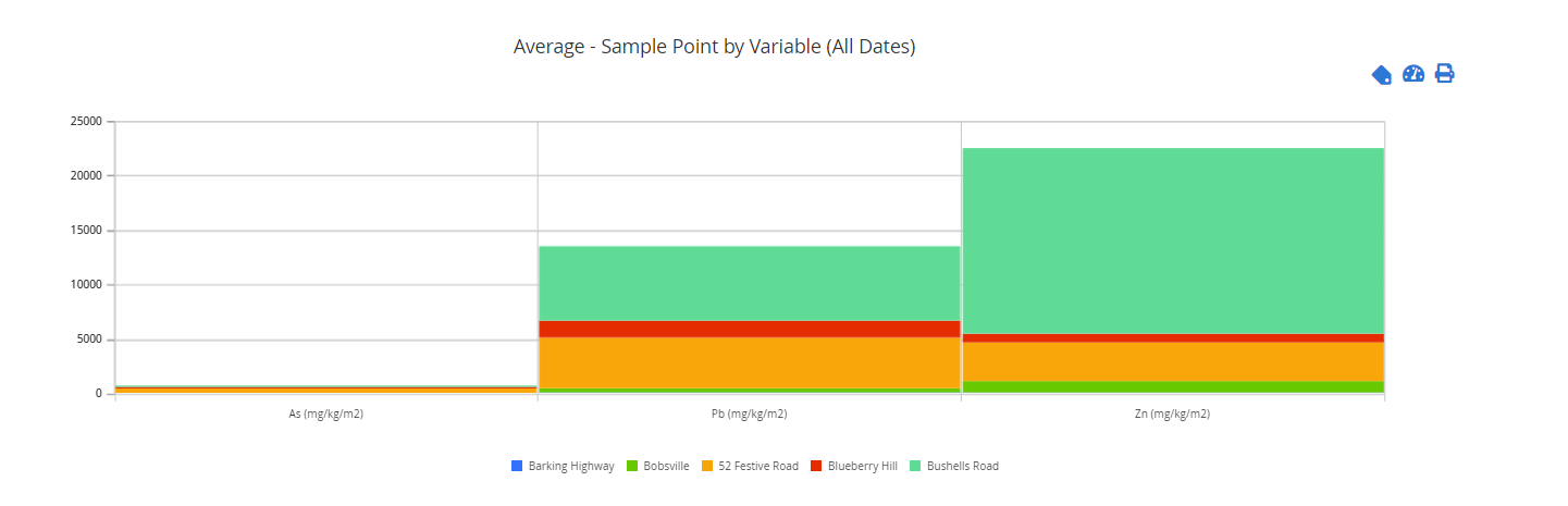
Then click on Draw Graph.
To amend the Summary Type, or to switch the X-Axis Grouping with the Data Series, use the additional settings. Then click on the Draw Graph
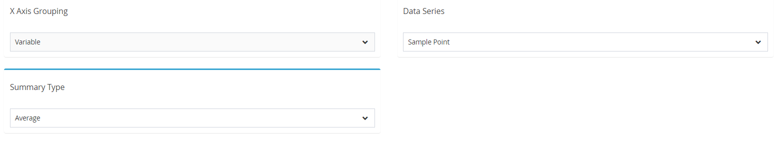
This example is toggled to summarise average concentrations of the Variables for each Sample Point chosen.